From the moment your clients hold your folders to when they start flipping through your presentation, it can be a game of touch and go.
Every second that your ideas are in front of them should count toward enhancing your image, which is why your best chance of giving a perfect first impression is in a folder that looks good.
For us, the secret to creating good artwork for a presentation folder is to always keep it simple, but grand. Before you dive into the specifics of designing your folder artwork, here are some things to keep in mind.
Folder Artwork Design 101: Easy Tips to Remember
1. Place Your Logo Tactically
If your logo is rectangular and edged, consider corner placements that can complement the edges of the folder. If it’s rounder or in a more complex shape, a center placement is always your best bet.
As the face of your brand, your logo deserves a prominent place on your presentation folder.
2. Elaborate Your Vision
To make a further impact, you can print your mission statement so your clients can have a good understanding of your vision and goals before they dive into your ideas.
Just be careful not to make it too long, otherwise your folder may end up looking too crowded and lengthy.
3. Add Images (Sparingly) to Inspire and Inform
Many companies choose to place images on their folders to either inspire or inform on the brand’s target audiences.
Make sure, however, that these images are absolutely crucial to communicating your brand; otherwise, it can make your folder too busy and become counterproductive to your folder design.
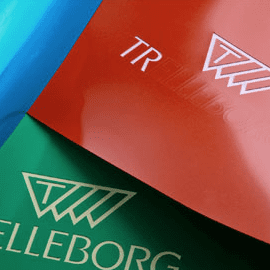
4. Use Color to Engage Emotion
On top of ensuring that the color of your folder is in line with your branding, it’s also worthy to consider the emotions that certain colors can evoke.
Here’s a list of popular colors and how they can affect your client’s perception:
- Black: Sophistication, exclusivity, edginess, mystery
- White: Purity, health, innocence, modern
- Blue: Trustworthy, inviting, communication, honesty
- Red: Passionate, important, action, intensity
- Purple: Luxurious, romantic, royal, spiritual
- Green: Abundance, natural, prosperous, energy
- Grey: Neutral, professional, intellect, compromise
5. Pick a Legible Font
It’s fun to experiment with fonts to see which one looks fancy or adventurous, but on a folder that might pass several hands, it just needs to be easily and quickly legible. But, this doesn’t mean you still can’t class it up a bit.
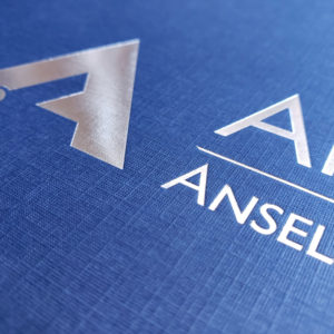
Try incorporating different colors of text to complement your branding, or throw on a metallic font to make it pop and shine.
Just don’t go overboard! Use no more than two font styles or font colors.
6. Choose Materials to Your Advantage
There’s nothing that impresses a client more than knowing you’ve been meticulous down to every detail, including how the folder will feel in their hands.
Always make sure to pick high-quality, durable materials for your folders. Even if your artwork is perfect in all other aspects, it won’t matter if it’s been printed on sloppy paper material.
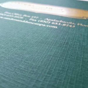
The Conformer Folder uses only 100# premium linen and 14pt-coated paperboard, maximizing the tactile presence of your whole presentation.
Get in touch with Conformer to learn more about how our folders are made.
7. Look for Sturdy Construction
When browsing for folders, pay attention to how the folder itself is put together. A poorly constructed folder will crease and damage your carefully designed artwork and waste your hard work.
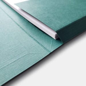
Look for features that reduce tension and eliminate chances of warping, like the Conformer Folder’s design of overlapping, unglued corners.
Plus, with score lines all around the pockets, their folders are engineered to hold up to ¾” of materials.
The last thing you’d want is to see your ideas falling out and scattering about.
8. Pique Their Interest with Windows
While this technically doesn’t qualify as artwork, adding front cover windows to your folder can be part of the aesthetic experience and ensures your ideas are falling into the right hands.
By placing your client’s name front and center, they’ll know the contents of the folder were meant for their eyes only.
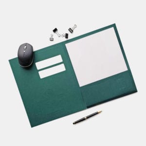
Alternatively, you can use windows as a fun and interactive addition to your presentation. For instance, you can fill up its empty spaces with a preview of what’s inside.
As your client’s time is limited and valuable, this quick glimpse could be the thing that entices them to flip through the rest.
Keep It Simple, But Grand
Keeping the above tips in mind, you’re now ready to design your own presentation folder.
At Conformer, we’re true believers that a simple, good-looking folder can go a long, long way.
With our superior folder materials and easy-to-use online customization tools, you can be sure that what you’re presenting to clients is always your best foot forward.


